The story of the “Ban Comic Sans” campaign is a marvel of digital-era cultural revolt. A quirky, tongue-in-cheek typography movement that ballooned into an enduring joke and occasionally thoughtful design critique. Here’s how our most reviled font became a symbol of typographic taste wars—and the fight against design ignorance.
The Birth of the Ban Comic Sans Campaign
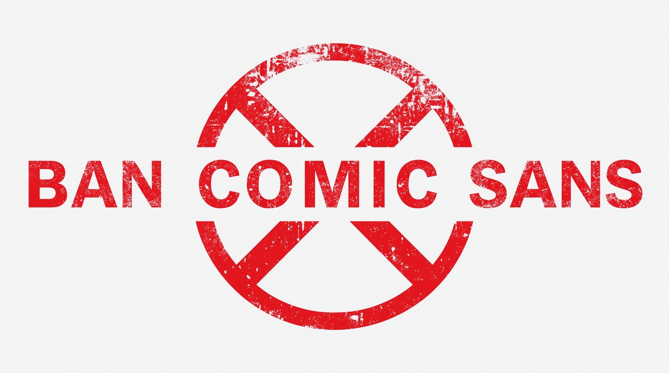
In September 2002, Indianapolis-based graphic-design couple Dave and Holly Combs launched the “Ban Comic Sans” campaign. What started as a satirical jab—born out of frustration when a former employer insisted the use of the playful font in a children’s museum exhibit—quickly became an internet phenomenon. The Combs created a website (bancomicsans.com), a manifesto, and even merchandise—stickers, t-shirts, mugs—championing a typographic ban as though it were a human rights violation.
The manifesto framed Comic Sans as more than a font—it was “the embodiment of turning up to a black-tie event in a clown costume,” a judgment that captured the absurdity designers saw in its rampant misuse.
Spread, Backlash, and Beyond
Comic Sans quickly transcended its original role in Microsoft’s friendly interface. Designed in 1994 by Vincent Connare to mimic comic-book lettering, it was meant to add personality to speech bubbles in Microsoft Bob, a user-friendly interface Rolls out with Windows 95. Yet its casual aesthetic found its way into solemn documents, signage, and even memorials. Notably, a Dutch World War II reconciliation monument used Comic Sans for inscribed names—only to be redone after public outcry.
The backlash fueled the campaign’s fire. Designers rallied, creating parody sites like “Comic Sans Criminal,” and games like “Kill Comic Sans” by AgencyFusion. During the same period, a Flickr group titled “Comic Sans” became a dumping ground for both adoration and ridicule of the font’s ubiquity.
Pop culture joined the fray, too. A planned 2010 documentary attempted to chronicle the font’s dubious legacy, garnering only modest crowdfunding support. Soon after, Google released an April Fool’s prank that turned search results into Comic Sans, poking fun at its notoriety.
Notable Figures and Institutions Weigh In
Vincent Connare, the font’s designer, strikingly has not been offended by the backlash. He has called it “the best joke I’ve ever told” and remarked that its success—especially among children and families—meant it accomplished its brief. Still, even Connare distances himself from its misapplications, especially in formal contexts.
Michael Bierut, a partner at the design firm Pentagram, has described Comic Sans as “a default punchline in the design community,” linking its overuse to a broader commentary on typographic ignorance.
Major institutions and public figures have unwittingly become battlegrounds for the font’s reputation. CERN, for example, used Comic Sans in slides presenting the Higgs boson discovery—an irony that did not go unnoticed. NBA owner Dan Gilbert sparked ridicule when he used Comic Sans to address Cleveland Cavaliers fans after LeBron James’ departure. And though unconventional, even Lord Steel of the UK’s House of Lords admitted to favoring the font merely because “he likes it”—regardless of decorum.
The Unexpected Reversal
By 2019, the Combs had a change of heart—or at least a comedic twist. They redirected their “Ban Comic Sans” domain to a “Use Comic Sans” campaign and Facebook page. Dave Combs explained that the original antagonism had “gotten out of hand,” and that over time he’d grown fond of the font in a strange, nostalgic way—“like an ugly dog,” he quipped.
Why It (Almost) Got Banned
- A visual rebellion against design faux pas and lack of typographic seriousness.
- A platform for designers to comically criticize widespread misuse of a casual font.
- A pop-culture vehicle that turned typographic taste into a playful battleground.
The “Ban Comic Sans” campaign endures as both myth and moment—proof that even a font can spark generational debate, meme culture, and a reassessment of what we consider “professional.” In retrospect, perhaps it wasn’t about hating Comic Sans after all—it was about demanding design integrity, even in our least serious choices.