Let’s take the world’s most misunderstood font—Comic Sans—and give it a comeback story that’s witty, sharp, and seriously impactful. That’s exactly what Dyslexia Scotland, teamed up with Innocean Berlin and WeTransfer, accomplished in their 2022 campaign, There’s Nothing Comic About Dyslexia.
A Brand-New Spin on a Hated Font
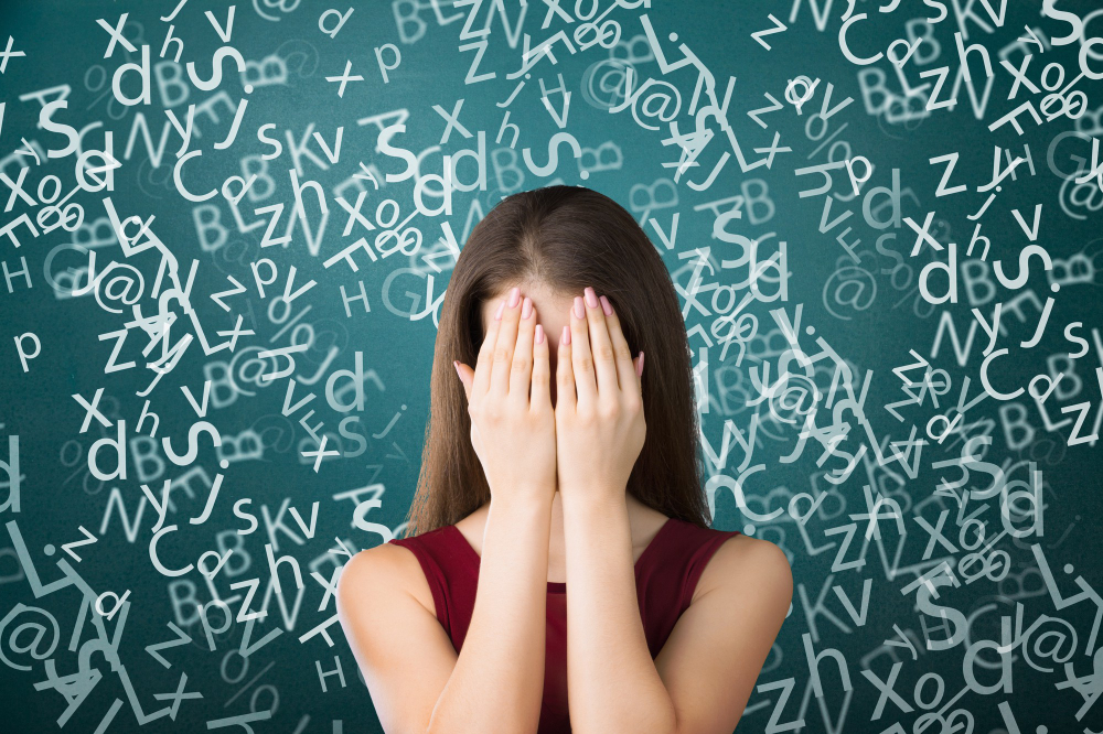
Comic Sans has long been the design world’s whipping boy. Its bouncy, uneven shapes have made it the punchline for amateurish or awkward design. But Dyslexia Scotland flipped the script. Instead of avoiding or apologizing for the font, they leaned in—hard. The campaign used Comic Sans to challenge designers, reminding them that the font’s quirks actually improve readability for people with dyslexia.
The campaign ran during Dyslexia Awareness Month in October 2022. It didn’t pull punches: designers encountered Comic Sans everywhere—in print, on street posters, social media, industry mags like Form and Slanted, and even on WeTransfer wallpapers seen by 87 million creatives each month.
Why It Worked (Yes, There’s Science)
Why is a font loathed by designers embraced by dyslexic readers? Comic Sans breaks many design conventions on purpose:
- Its letters have distinct shapes—say “p” vs. “q”—which helps avoid confusion.
- The irregular, rounded shapes reduce visual crowding, making each letter easier to recognize.
- Wide spacing between letters helps reading flow, a benefit supported by research in letter spacing and dyslexia.
Organizations like the British Dyslexia Association and the Dyslexia Association of Ireland officially recommend Comic Sans—or other sans-serif fonts like Arial—for better clarity (mentalfloss.com).
From Protest to New Typeface: Inconstant Regular
Here’s where it gets clever. The campaign didn’t just use Comic Sans—it also introduced a new typeface called Inconstant Regular, designed by Daniel Brokstad. This font maintains the readability benefits of Comic Sans but with an aesthetic edge that designers might actually like.
The campaign wasn’t about forcing Comic Sans into daily use. It was an invitation: look at what works; now design something equally readable but less polarizing.
Big Numbers, Bigger Conversation
The results speak louder than any slogan:
- 35 million global impressions.
- 5 million worth of earned media.
- Over 15,000 downloads of Inconstant Regular.
- A ripple effect led to projects like inclusive design courses at Miami Ad School Europe.
Did designers start using Comic Sans again? Not really. But they did start talking—and thinking—about their decisions. The campaign thrust accessibility into the spotlight, nudging designers toward fonts that respect both aesthetics and readers’ needs.
Designers, Become Accessible Allies
This campaign is playful, but it’s also a call to action: designers, you shape how information reaches people. You can choose beauty—but not at the cost of clarity.
Comic Sans became the messenger because its flaws are its strengths for dyslexic readers. It’s not that every font needs to be Comic Sans—far from it. But if we’re creating tools and spaces that everyone can use, accessibility deserves more than a footnote in design specs.
In the end, There’s Nothing Comic About Dyslexia managed a design coup. It took the most spurned font, wrapped it in irony and empathy, and asked designers a loaded question: “Can we make fonts as thoughtful as they are beautiful?” The answer? Designers responded. And that’s the real comeback story.