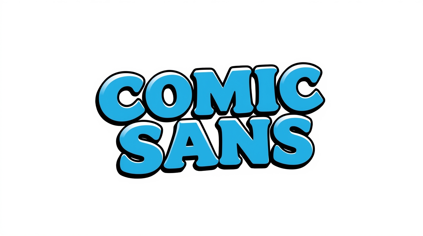
What Is Comic Sans?
Comic Sans is a casual, sans-serif typeface designed in 1994 by Vincent Connare for Microsoft, initially intended for use in cartoon speech bubbles in early user interfaces like Microsoft Bob. Though built to feel playful and approachable, it was later bundled with Windows 95 and quickly became ubiquitous (wired.com).

Why Is Comic Sans Hated?
1. Contextual Misuse and Inappropriate Settings
What began as a lighthearted font for informal, child-friendly settings started appearing in places wildly out of context: formal documents, signage, memorials, and even gravestones. This mismatch between tone and usage became a touchstone for ridicule.
A Reddit user observed: “It’s meant to be a silly light hearted font, but in the 90s and early 2000s it got used by amateur designers… ambulances, funeral homes, hospital cancer wards, etc”.
2. Amateurish Aesthetic and Design Inconsistencies
Design critics often cite Comic Sans’s uneven letterforms, awkward kerning, and lack of stylistic finesse—qualities that make it feel “sloppy” or unprofessional (olimarstudio.com). The font’s rounded, exaggerated characters evoke cartoons—not credibility.
Simon Garfield calls its look “willfully idiosyncratic… like a packaged cookie when you expected homemade”.
A Reddit comment sums it up: “In my opinion, because it’s lazy… it shows no extra care or thought went into it”.
3. Overexposure and Internet Bandwagon
Bundled with Windows and highly accessible, Comic Sans was used everywhere, leading to burnout and ridicule. Designers even formed a “Ban Comic Sans” campaign in 1999—though campaigns later morphed humorously into “Use Comic Sans”. Over time, hating Comic Sans became part of design culture, amplified by memes and online mockery.
Comic Sans and Dyslexia
Despite its poor reputation, Comic Sans has a surprising advocate: accessibility, particularly for readers with dyslexia.
Multiple users on r/Dyslexia report Comic Sans is easier to read because its letter shapes are distinct and resemble natural handwriting. One wrote: “I always go for Comic Sans… Every letter is distinct”. Another said: “I copy longer texts in an office program and change the font to Comic Sans. It makes reading way easier. Its a shame Comic Sans has such a bad reputation.”.
The British Dyslexia Association and the American Institute of Graphic Arts have acknowledged Comic Sans’s helpful “character disambiguation” and variation in letter heights, which can aid readability (independent.co.uk).
Comic Sans is a Paradox
A font born out of whimsy that became infamous for its misuse. Designers argue against it due to its amateurish appearance, lack of versatility, and overuse in inappropriate contexts. Yet, for some—especially individuals with dyslexia—its readability remains a strong benefit.
Whether you loathe or secretly favor it, Comic Sans reminds us that typography sends powerful messages. It sparks conversations about design, accessibility, and appropriateness—one awkward curve at a time.